Nostalgia sometimes gets the best of us—hence the reason we geek-out when we see emulators for SNES on Apple devices or N64 on Android.
The excitement lies in getting our hands on classic video games and their respective systems, but older computer operating systems are also causes for reminiscing. It's all about reliving the old days with our new, modern, and powerful gadgets.
Decades before we had Mac OS X, and more specifically Yosemite, there were much more simple Mac operating systems that consisted of stripped down windows with no toolbars, not many colors other than gray tones, and not nearly the functionality, speed, or power that we have today.
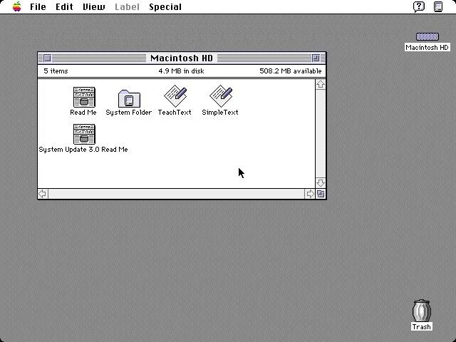
System 7 desktop (which came out about 8 years before OS 9 did).
But with just a few tweaks, you can make your powerful Mac OS X Yosemite look more like the "System Software," "System," and "Mac OS 9" classics that you knew and loved from the '80s and '90s—without having to lose any of the functionality.
Increase Contrast
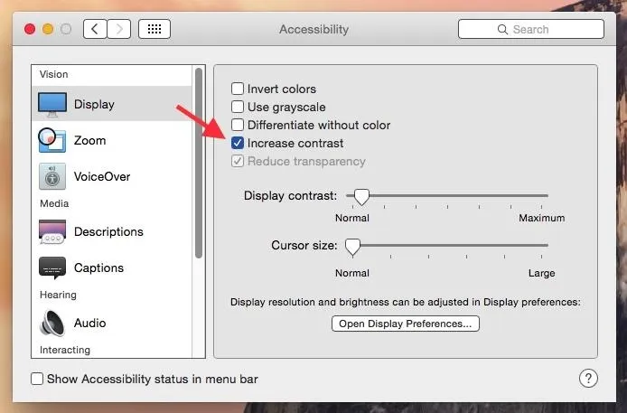
Go to System Preferences -> Accessibility -> Display and check the box next to Increase Contrast. This setting creates a border around windows, buttons, icons, and other UI elements, making them easy to distinguish.
Switch to Graphite Appearance
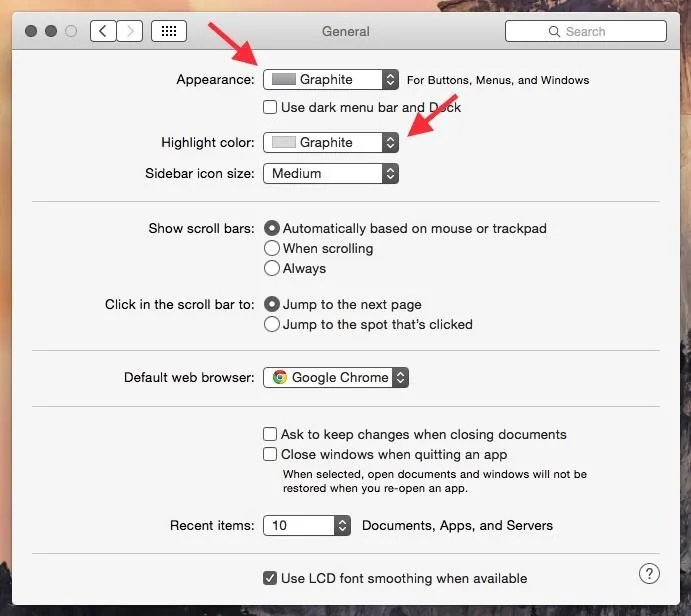
In System Preferences, go to Display and select the Graphite theme for both Appearance and Highlight color.
Appearance will change the color of your buttons, menus, and windows to a dark gray, while Highlight color will change the color of the any selection you hover over in menus to dark gray.
Change Wallpaper to Dark Gray Medium
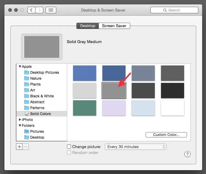
Now it's time to change the wallpaper to a solid color, specifically the dark gray background that was common on the older Mac systems.
Right-click on your desktop background, click on Change Desktop Background, go to Solid Colors, then select Dark Gray Medium.
Hide Finder Toolbar
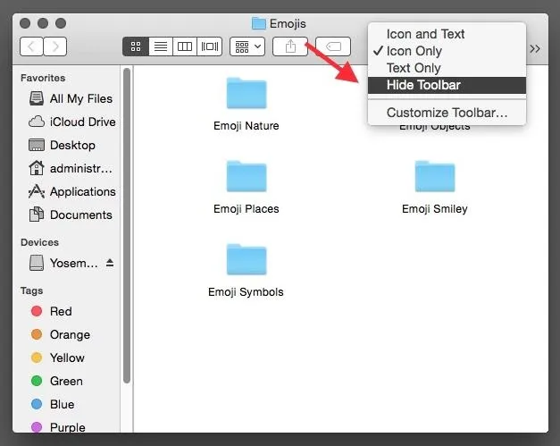
Finally, we're going to give all the Finder windows a simple and minimal look. Open any Finder Window, right-click on the toolbar, then select Hide Toolbar.
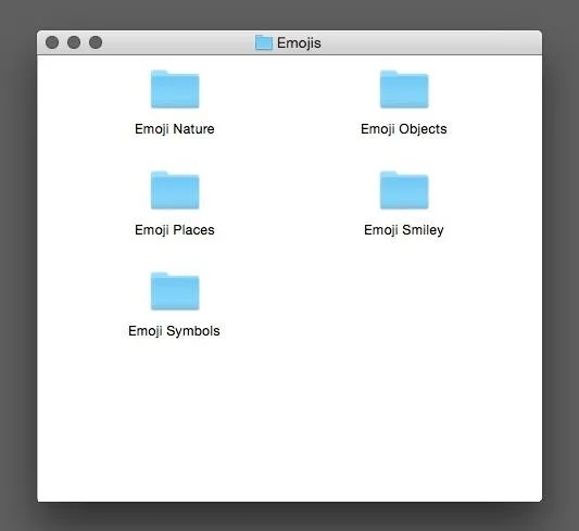
Your window should now look like this, with no side or top toolbar, just the window and its contents.
Check Out Your Finished Result!
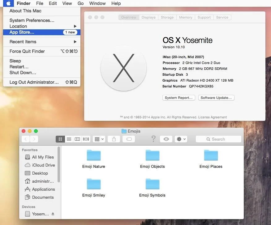
If you've made all of the changes from above, your computer desktop should have gone from this...
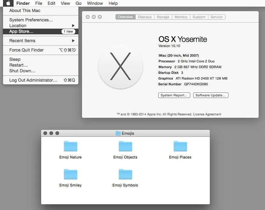
To this simple, gray-heavy, old-school look.
To go a step farther, you can go to System Preferences -> Accessibility -> Display and check the box next to Use Grayscale, which eliminates all color aside from grayscale, but I personally like colored icons as it gives the retro look a modern touch.
Do you have any other tips on how to make Mac OS X 10.10 Yosemite look like a pre-Mac OS X operating system? Let us know in the comments below or on Facebook and Twitter.












Comments
Be the first, drop a comment!